Preppr
Hi-fidelity prototypeYear
2021
Role
Product Designer
Business Analyst
UX Researcher
Deliverables
User Research
Financial Statements
Business Model Canvas
Hi-fidelity Prototype
Tools
Photoshop
Excel
Figma
Miro
The Problem
Time and money are two of the largest barriers to developing healthier eating habits for Canadians who live alone. Taking into account food prep, grocery shopping, time to cook, and food wastage can be especially overwhelming.
Preppr takes the stress out of meal planning on a budget by providing affordable meals that are nutritious and delicious.
my contributions
This project consisted of three iterations where I was the User Experience Researcher, Business Analyst, and Product Designer respectively. Working in these three roles were required for the project but I mainly worked as a product designer to navigate through the design thinking of Preppr.
iteration one
User Experience Researcher
How might we facilitate healthy diets for people living alone?
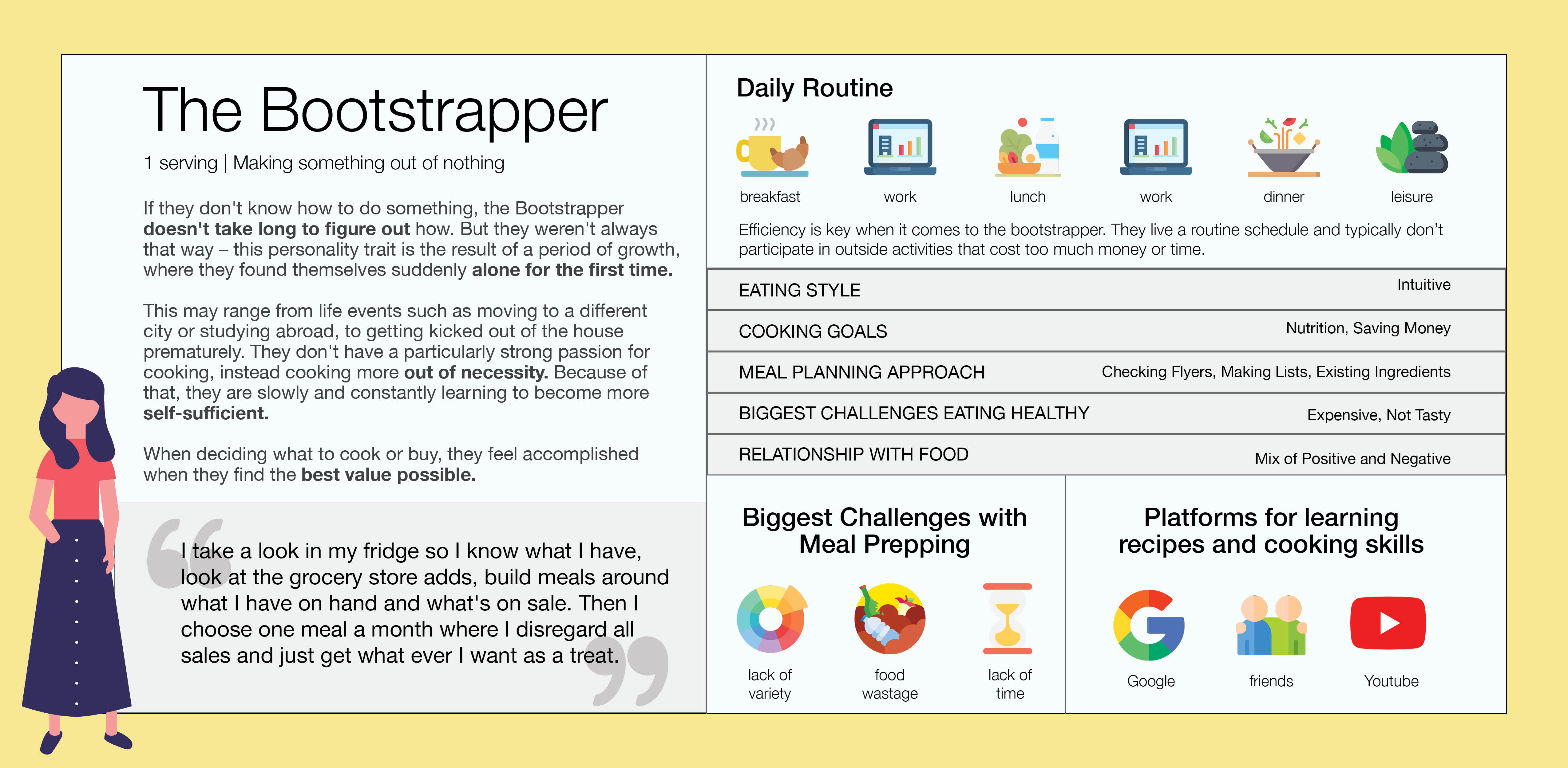
target users
Preppr's target users are people who live alone/cook for one. As we only knew a limited amount of people who fit this persona, we turned to Reddit to ask for their relationships with food. With over 100 responses on different threads, we established three user groups.
testing
Is this product solving an actual problem?
Taking an agile approach with our design, we made assumptions based on what we believed users would want. With those in mind, I worked with the design team in order to figure out what aspects they wanted to test in addition to our user questions.
From there, we found our users and started working on the script to be used later on. Even though the testing was during the pandemic, I was lucky enough to test our product in person with several roommates.
Research key findings:
iteration two
Business Analyst
How profitable is this application?
financial feasibility
Being as saturated as the food and drink market is, we had to figure out how we could differentiate our app as well as where our revenue streams would come from. Using a business to business approach seemed more profitable than a business to consumer one so we focused on developing multiple revenue streams through this.
Approaching businesses for actual quotes was outside the scope of this project, so financial statements were developed with data from industry research.
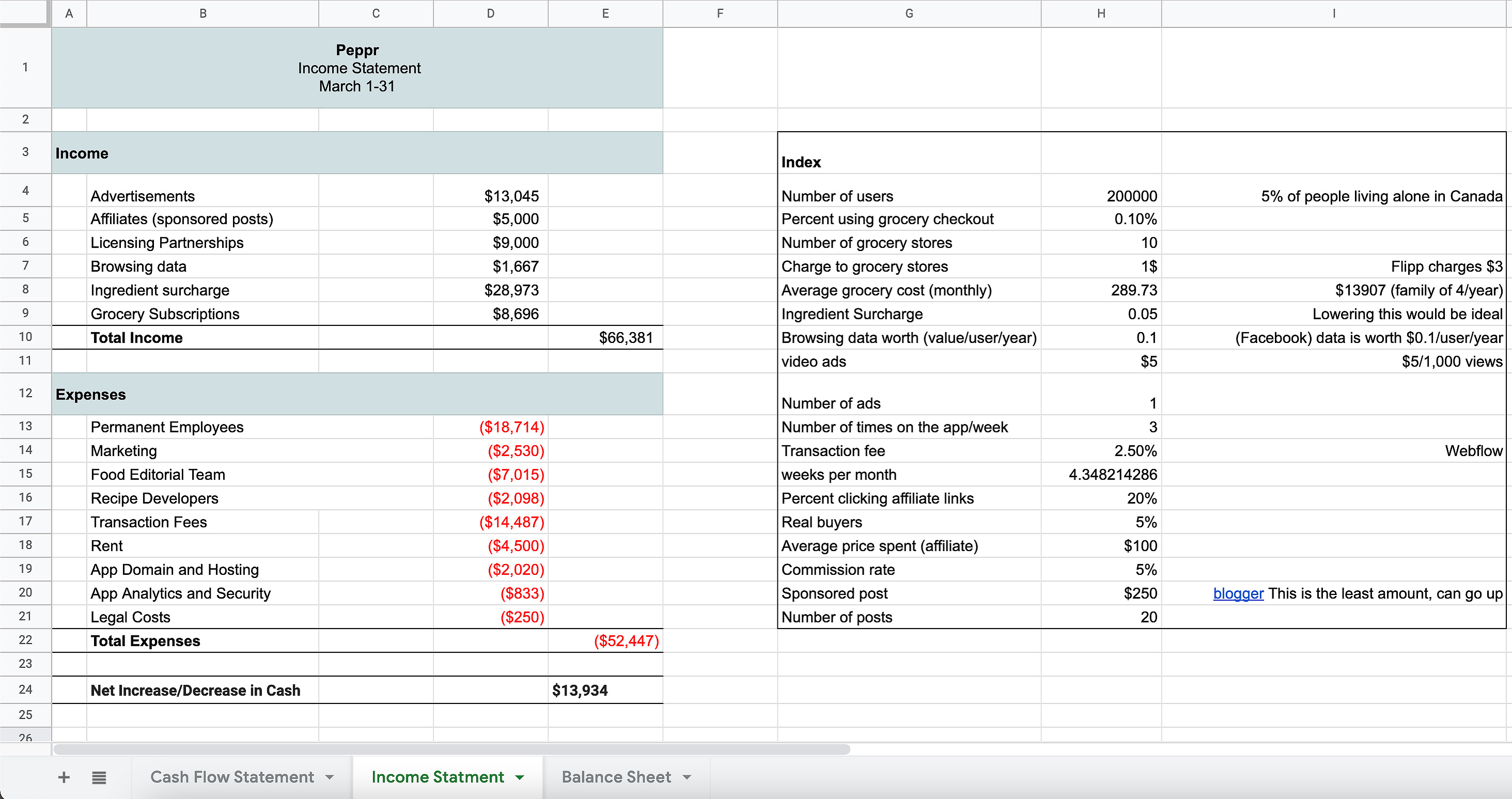
To ensure financial stability, we not only wanted to work with existing grocery stores but also include features such as our own Preppr points and scraps buddy. While we do not get any direct revenue from consumers, having these differentiation features and multiple revenue streams can ensure longevity of our product.
iteration three
Product Designer
I picked up this project again after two iterations of design and testing in order to develop the high-fidelity prototype (I worked on the design in iteration one). While the initial designs had completed aspects of our product requirement list, the key features, branding, and cohesiveness just weren't there.
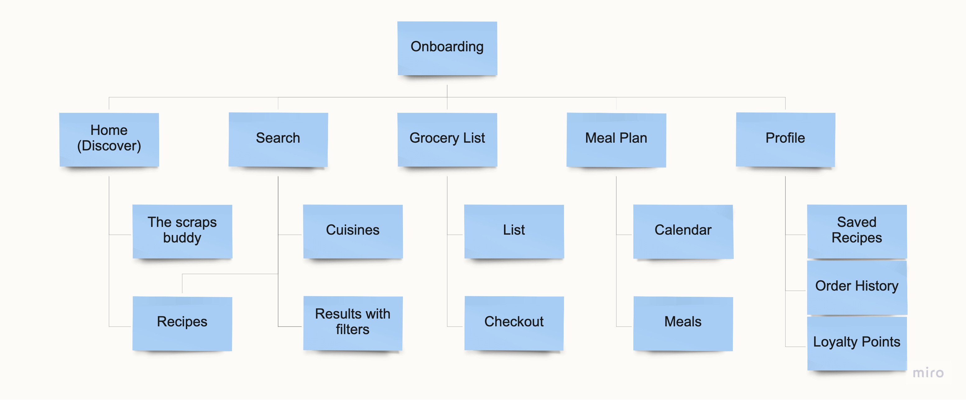
information architecture
Even up until the third iteration, the flow of our screens were still confusing to our users. To start fresh, the design team created a new flow based on our usability testing and our key features.
feature breakdowns and decisions
Recipe Exploration
For many people, finding new recipes is the best part of cooking. For others, it's more trouble than it's worth. It was important for us to give users different outlets to find what they're in the mood for whether it's spontaneous, ingredient driven, or they're just craving a certain dish.
discover and search
A simple and straightforward interaction that directly addresses our users' goals of finding a recipe
These pages were designed with simplicity in mind. Being front and center, users can browse through our explore page and spark inspiration for their current or future meals. If they're looking for specific items, our search function easily finds any meals they're in the mood for.
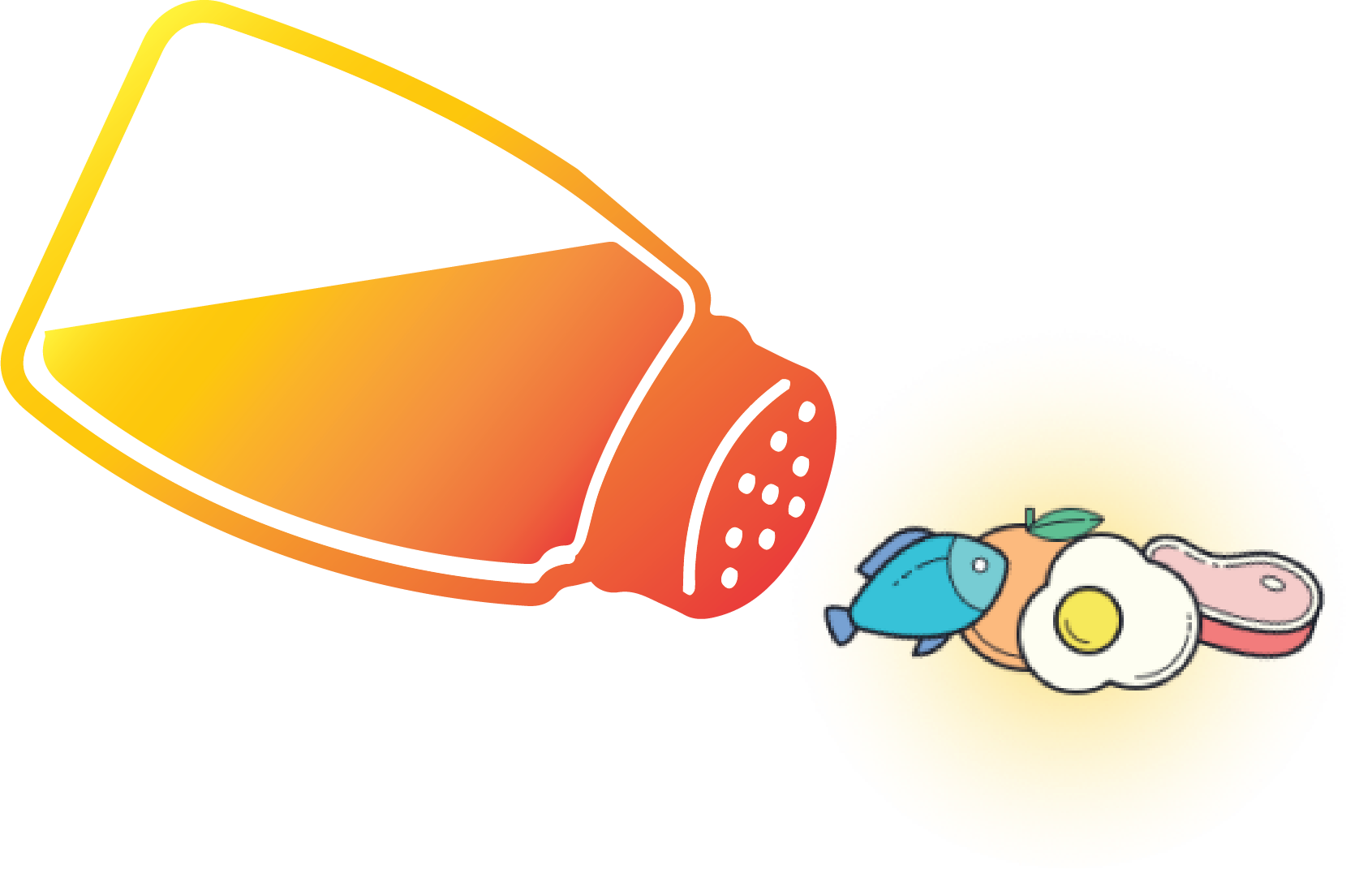
the scraps buddy
An interactive and customizable way to create leftover meals
For many of our users, using their existing ingredients is how they meal prep. Instead of having to individually Google ingredients, we created a fun and interactive method to find recipes not only based on your ingredients but also on your meal and cuisine.
past iterations
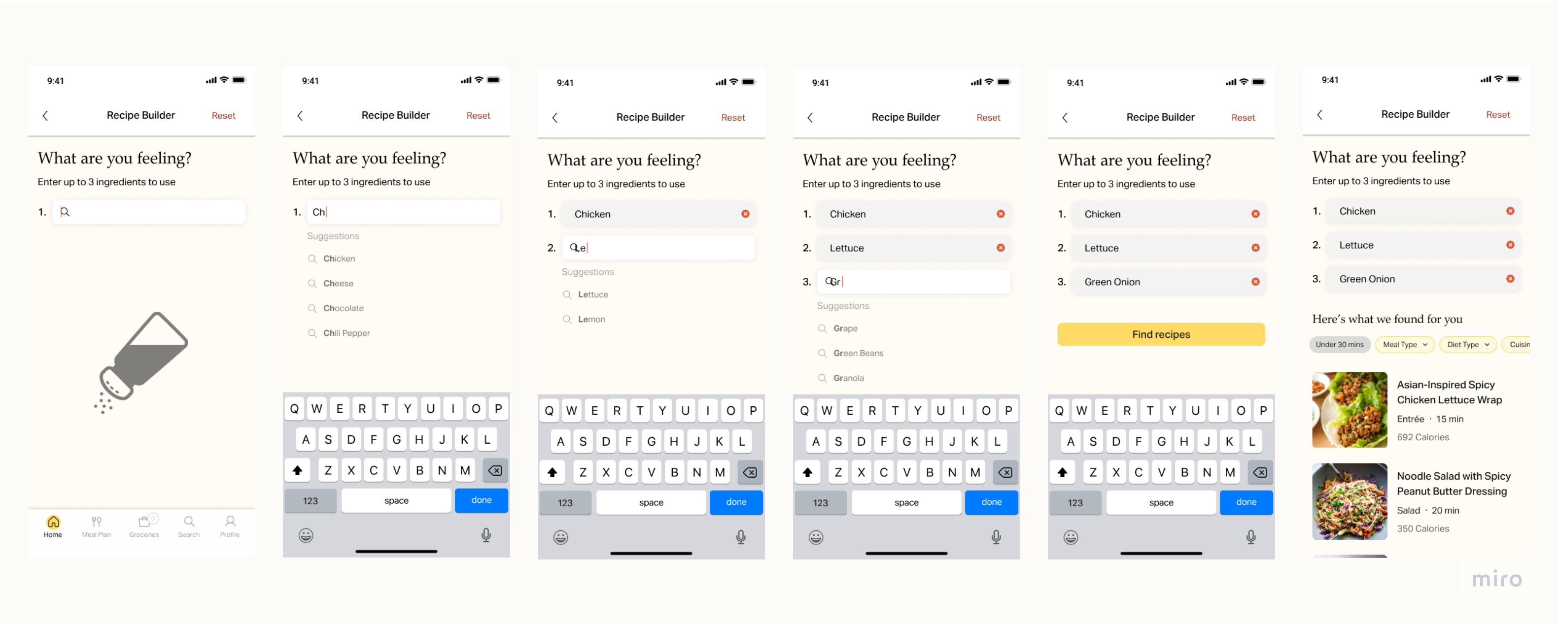
Previously, our Scraps Buddy lacked personality and so the interaction did not seem fun to use. While having the same technical functionality, the differentiation was not there from existing applications and neither was the customization. By making the process more fun, users will feel more inclined to continue using it, if not only for the functionality.
Purchasing Groceries
list
Don't reinvent the wheel, just realign it
From our research, we found that most people prefer the standard checklist for grocery shopping. With that information, we decided not to use a new style but stick with what people were familiar with. We chose to include standard features like the checkbox crossing off the ingredient but also unique features like sorting by recipe.
integrated shopping
Prioritizing in-app functionality
The pain points that we wanted to solve were time and money. By including an integrated shopping function users can save time by grocery shopping online, and save money by meal planning. In terms of functionality, we chose to create an in-app browsing system to streamline the grocery shopping process.
Meal Planning
Multiple streams to add meals
Meal planning was a key feature of Preppr so we wanted to make sure users had multiple ways to use it. Whether users want to quickly add their favourite meals on the meal plan page or add individual recipes from the browser, using the function will be simple and integrated. Using popups, the task wouldn't seem too intrusive and users would understand it's a fast interaction.
past iterations
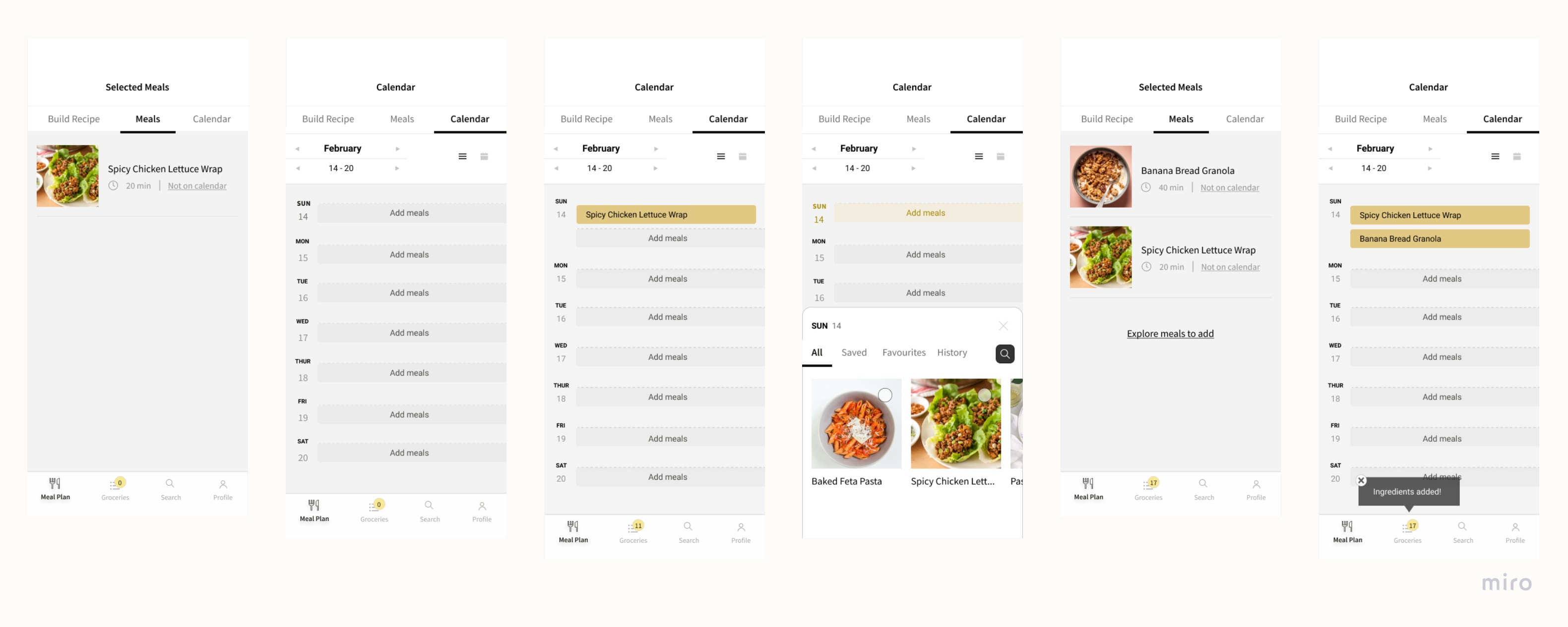
In the previous iteration, we had also used pop ups as a way to add the meals. However, the weakest point of this design was how long it would take for users to add their meals. By allowing users to add multiple meals at once, it saves them a lot of time and our auto meal sort system also streamlines the process.
Customization
goals and health restrictions
Personalized needs for every individual
Everyone has a different relationship with food so we wanted our users to be able to specify their preferences. By having it in our onboarding, our users wil feel like the app is catering to their needs. If users change what their goals are, the account preferences allows them to modify their choices.
ingredient substitutes
A quick and non-intrusive way to avoid running to the store
One of the frustrating things we found about cooking healthy is not having a certain ingredient. Our substitution feature allows users to know what they can use instead and bypass this frustration.
design system and branding
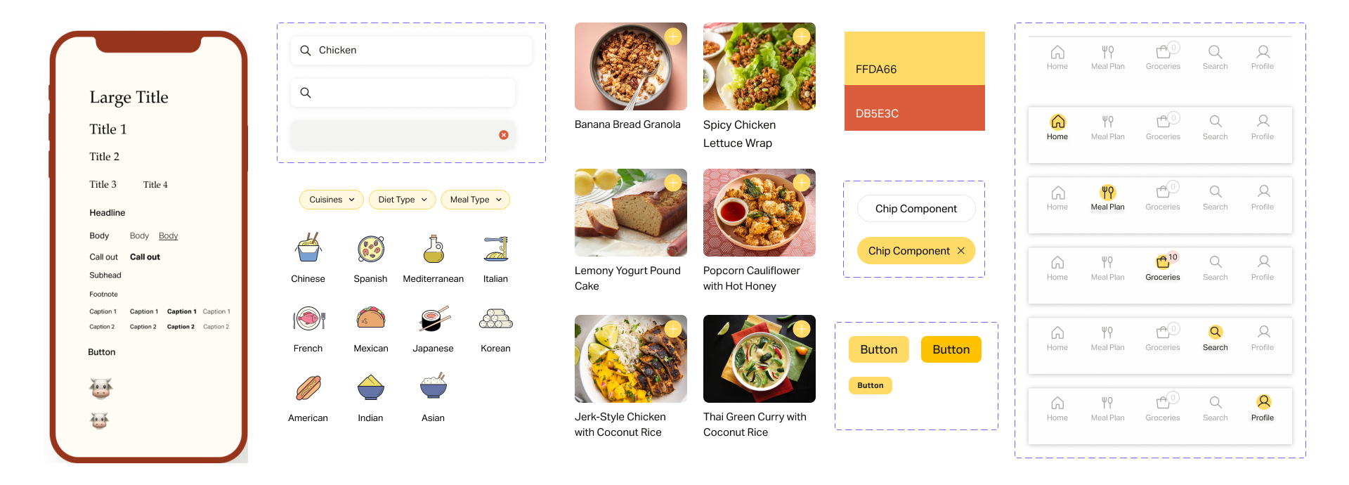
In the implementation stage, my teammate and I created our design system in order to create cohesive components for our branding. In order to give our application a fun and playful brand, we went with a bright yellow as our primary colour and a burnt orange as our secondary. The mix of photography and graphics icons also creates a lively personality to keep users engaged.
Next Steps
Inventory, ingredient life, loyalty program, partnerships
For the future, Preppr has a few more features to implement. The main one is an easy way for users to implement their current ingredients. Once that feature is implemented, our Scraps buddy can even further curate recipes for the user. Having the inventory can also allow users to get ingredient lifelines to teach how long specific ingredients are good for. In terms of business, our next steps include implementing our full-fledged loyalty program as well as creating more partnerships,
Takeaways
Holistic design, heuristics, KPIs, emotional branding
One of my biggest learning moments for this project was picking a Key Performance Indicator (KPI) for our business and designing Preppr to meet that goal. Our original idea was too broad and for our first two iterations, we lacked direction. By figuring out our KPI, we were able to focus on our minimum viable product and improve our key features. Beyond that, I also learned how to incorporate heuristic evaluations and emotional branding in order to create a functional and aesthetic product.