Year

2020-2021

Role

Product Designer

Deliverables

User Research
Business Model Canvas
UX/UI Design
Hi-fidelity Prototype

Tools

Photoshop
Illustrator
Figma
Miro

Medley characters

Overview

Medley addresses the gap in comprehensive Canadian sex education by providing factual information, interactive activities, and abundant resources. Awarded “highly commended” solution to the RSA Redistributing Health brief.

Medley is an interactive website which aims to comprehensively educate youth about inclusive sex education.

my roles and responsibilities

I was one of the Product Designers responsible for research, experience strategy, and user interface design. I worked alongside four teammates from conceptual development to high-fidelity website prototyping, ensuring business requirements were being met while advocating for user needs. I also assisted with usability testing through scriptwriting and conducting interviews.

The Problem

Can I never lose my virginity if I'm gay?

There is a clear disconnect between the heteronormative Canadian sex education curriculum and what young LGBTQ+ are actually looking for.

Failing to address the intricacies of LGBTQ+ relationships, young Canadians rely on possibly misinformative online sources for the bulk of their sex-education and self-discovery leading to the unknowing development of sexual risk behaviours.

The Goal

Proactively prevent sexual risk behaviours by creating a safe space for LGBTQ+ youth to learn.

Research

Understand the pain points youth face in the current system

competitive analysis

Our first step was to research direct and indirect competitors of the industry to better understand the problem.

For many, school taught sex education is their only reference but factors like conservative ideologies and lack of funding can skew the information being taught. Other methods of learning often include Google, Twitter, and even pornography.

78% of LGBTQ+ youth report using the internet for sexual health information. 46% of these sites are inaccurate.

users

While our assumption was that most youth did not receive comprehensive sex education, more information was needed to validate the pain point. Using a survey, we analyzed 75 responses to various questions relating to education, sexuality, and attitudes. With our initial assumption confirmed, we moved to learning more about our user with an empathy map.

"Being bi, I obviously knew how sex with a man and woman "worked", but when I first started dating a woman I had no idea how anything worked... even though I'm a woman."

hmw

To define our problem, we used “how might we” statements and started narrowing down our goals for the project. First by identifying challenges we believed we might face, then organizing them into HMW goals for the long term.

Research takeaways:

  • The gap in Canadian sex education has led to dangerous physical and mental health behaviours
  • Users want to learn! Biggest barriers have been comprehensiveness and accessibility
  • Lack of good sex education is a multifaceted problem, HMW goals should address all solutions
  • Define

    Who are we designing this product for and why?

    In order to have the biggest impact normalizing LGBTQ+ experiences, our product caters towards youth aged 15-24. Using this younger age group, we can address sexual health issues and behaviours before they become a risk.

    Our target audience is LGBTQ+ youth aged 15-24.

    Ideation

    With an understanding of our problem and audience, we kickstarted the ideation process using a mindmap. By linking topics together, we grew our minimum viable product list with potential features that would hit our HMW goals.

    Individually we used Crazy 8s to brainstorm as many solutions as we could in 8 minutes. Some of mine included a Myer-Briggs-style quiz with resources, a reproductive health application, and some sort of social media campaign.

    With potential solutions thought up, the question remained: what is possible?

    Decide

    Impact and feasibility were our top requirements when looking at the ideas. Not only did we want to solve the problem, we wanted the solution to have a positive impact on the LGBTQ+ community. My ideas (pink stickies) were generally high on impact but only with further refinement would the idea be completely feasible.

    Our solution, Medley, derived from the original quiz idea as we did not want to box in LGBTQ+ members with a specific quiz.

    Prototype

    Writing, wireframing and designing out the solution.

    To kickstart the design phase, we started off with deciding the vibe Medley was going to have and created a moodboard for it. The brand should feel fun and welcoming in order to cater to all ages and also normalize sex. Alongside our moodboard, we used heatmaps and trends to begin our wireframing process.

    information architecture

    In order to ensure the topics covered would be impactful and accessible for our users, we made a sitemap for Medley. Here we mapped out all the content that needed to be researched, wireframed, and prototyped. Following our HWM goals, we created our topics and features to facilitate learning in a safe environment.

    Medley sitemap
    Site map for Medley.

    Our team wrote all the copy for the site to keep a consistent tone as well as to better empathize with our users. I also did research on obscenity laws surrounding sex education to see how explicit our topics could get.

    feature one

    Explicit diagrams to facilitate interactive learning.

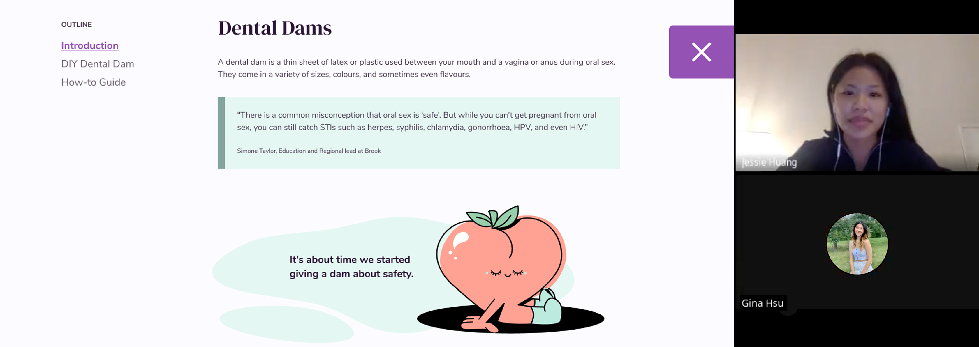
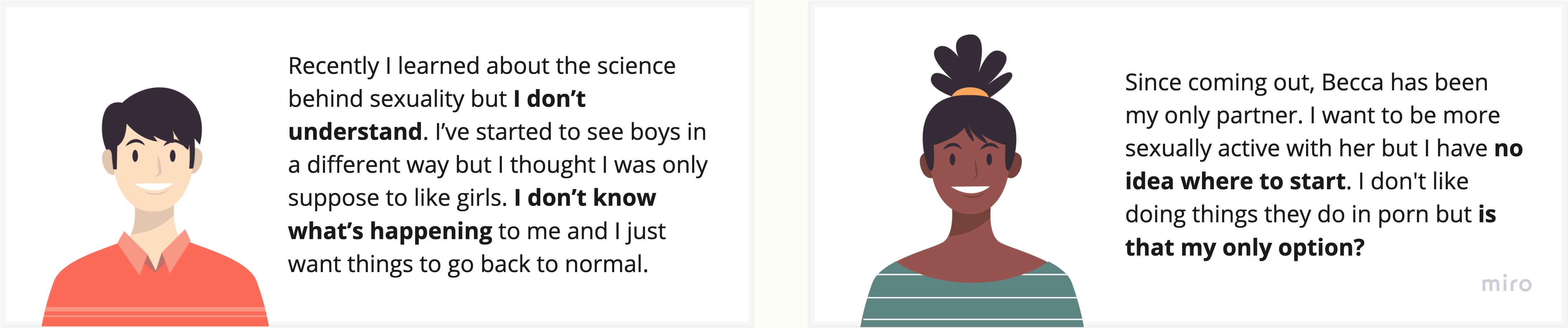
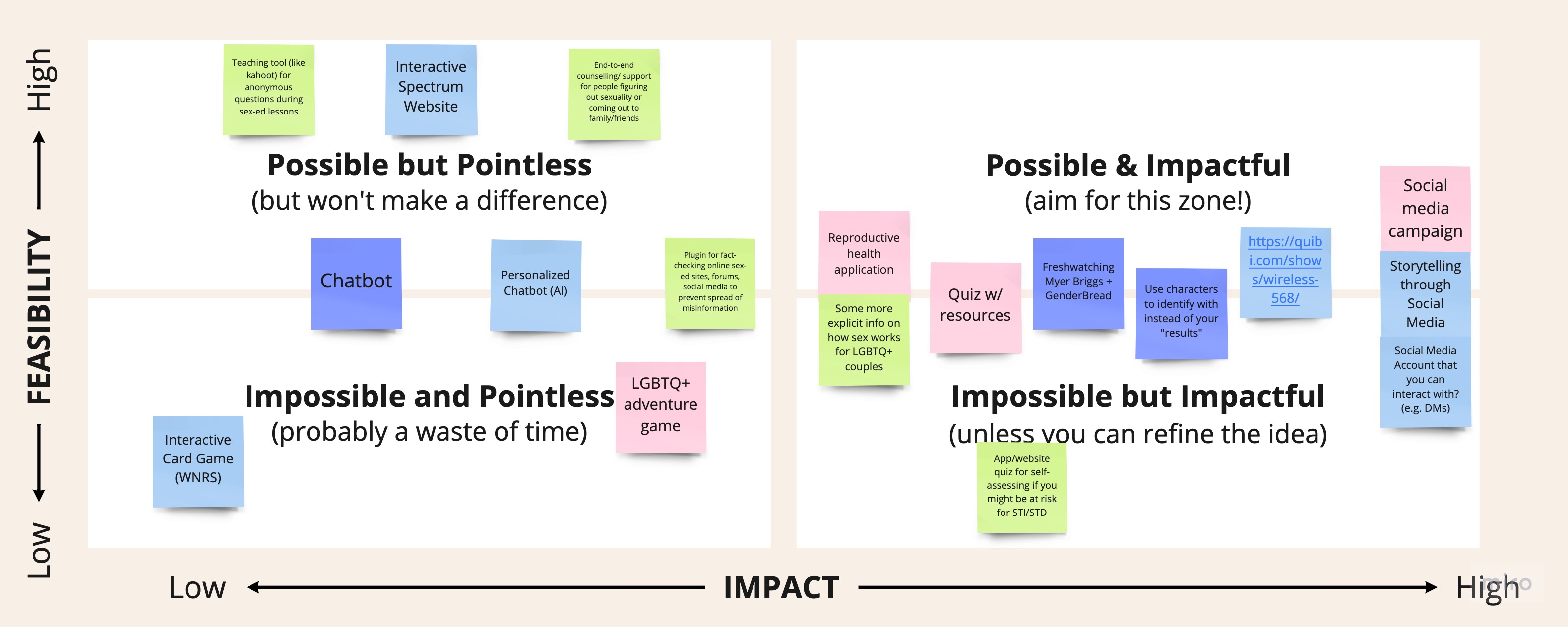
    While learning how to put a condom on a banana may be sufficient to the government, Medley is designed to phase out the stigmas surrounding sex.


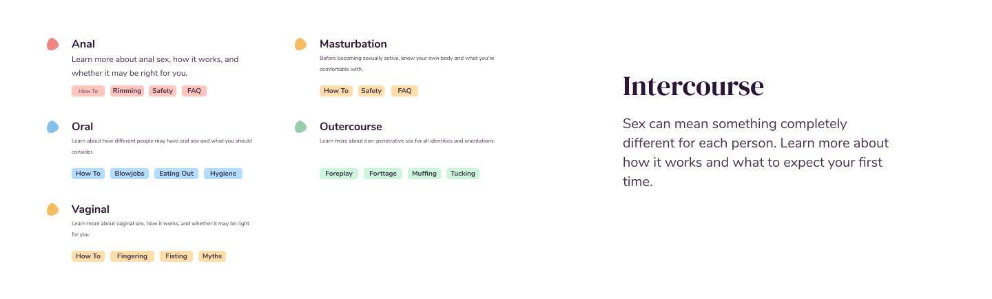
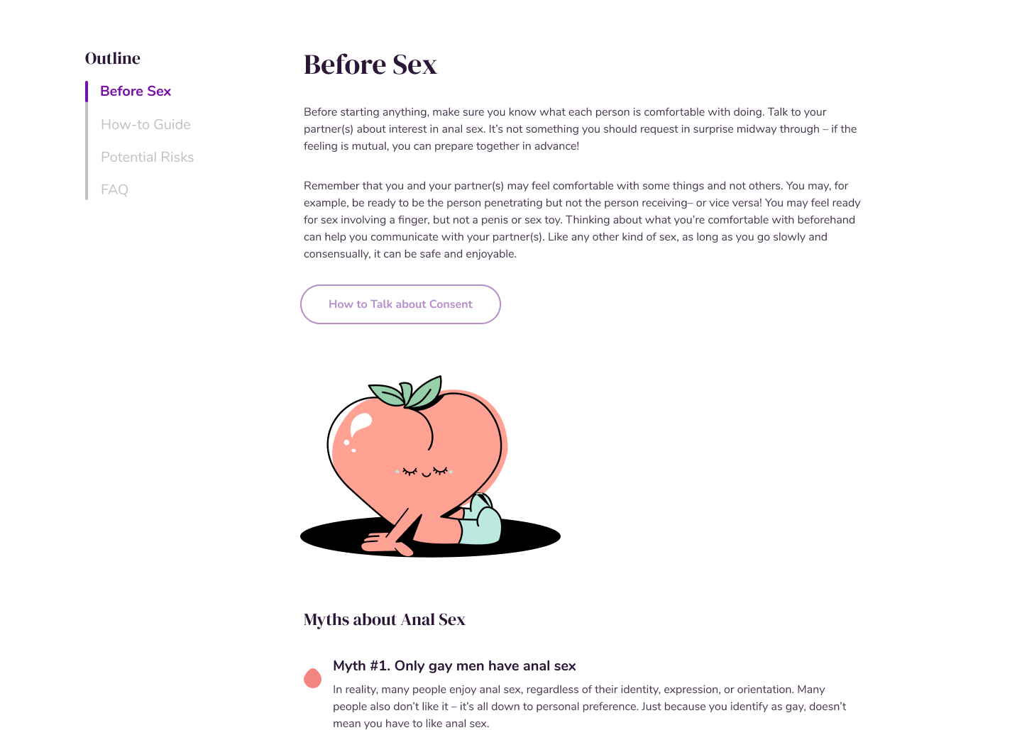
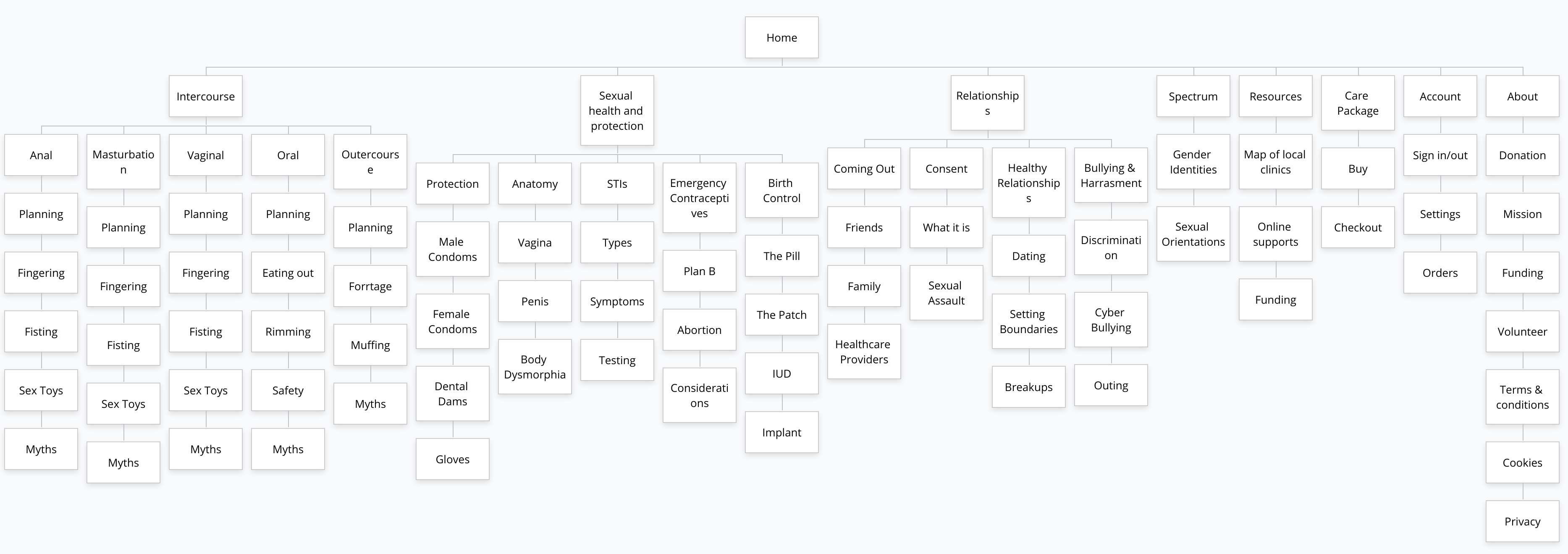
    To facilitate this, we created click-through diagrams about topics like fingering, coming out, and STIs. Using gender-neutral terms, we aimed to educate and not alienate.

    feature two

    Quick exit for those from unsupportive homes.

    Unfortunately, not every loved one supports the LGBTQ+ community.


    To avoid accidentally outing or miseducating our users, we created age restrictions, monitored our content for medical accuracy, and implemented a quick leave.


    Medley aims to educate people in the least intrusive way possible so implementing a quick leave was a must for us.

    Validate

    Testing our product for usability, content, and goals.

    Throughout the design process, we had different people test out Medley during the low, mid, and high-fidelity phases. Doing this, we could continually iterate our content and design to best meet the needs of our users.

    Our usability testing was conducted virtually through Google Meet.

    We gathered feedback virtually through video calls and had our users go through cognitive walkthroughs, explaining their thoughts out loud while we took notes.

    "The mental model I made in my mind was disrupted when the labels weren't what I expected"

    Testing takeaways:

  • Heuristics matter a lot for keeping user attention, especially when trying to teach youth
  • Bite-sized content is good for quick learning but only text doesn't leave a lasting impression
  • Images and diagrams can explain a lot more than just writing alone can
  • Iteration

    HMW make navigating through our site seamless

    Being able to find content quickly and efficiently is key to a successful educational website. By putting key pages in the navigation bar, users don’t need to look all over for topics we cover which allows for better retention rates.

    Details like showing active pages as well as side navigation bars also allows for users to quickly run to the information they need rather than waste time or even leave the site.

    previous iteration

    In previous iterations, our sub pages were all different, making it hard for users to build a mental model. The colours also didn’t change between switching dropdowns so users thought it was the same. Users liked the idea of a sidebar but the design drew attention away from the content.

    HMW evoke emotions through design and branding

    Using fun fruit shapes to teach sex education, Medley is able to normalize sexual health and behaviour for all ages. This allows for less stress on the users when navigating “taboo” topics and makes them more comfortable using Medley’s services. Having a fun brand and being medically accurate, Medley leaves a lasting impression on its users, prompting them to return to learn more.

    previous iteration

    Our original focus was ensuring the content tone was easy to understand but we realized that alone would not evoke an emotional response to our brand. All the individual components were there but the product did not look cohesive nor did it look trustworthy.

    Next Steps

    More iteractions, map implementation, policy change

    Overall, Medley's tone and characters bring the content to life but the interactive diagrams need to be more dynamic. Having this as the next step would be to allow for better user engagement as well as retention.

    After that, implementing our map to connect with local resources and adding an aspect of lobbying for policy change can allow for greater impact.

    Takeaways

    User research, storytelling, adaptability

    I really loved this project and the real-world applications it provided but one of my biggest qualms was the lack of LGBTQ+ members within our group members. Doing a lot of research helped us overcome this problem but real world experiences provides more empathy and data than surveys.

    Another element I learned from this project is the importance of logical thinking and adaptability, especially in group settings. Knowing when to look at the big picture over-focusing on minor details can save a lot of time and energy better spent elsewhere.

    I hope that Medley sparks change in the sex education curriculum or that companies will provide better services to the LGBTQ+ community.